")
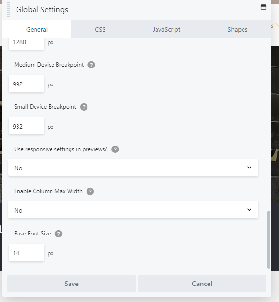
Traditional mobile settings are targeting mobile devices with a max-width of 400px. But Iphone just had to go bigger and make a Pro Max that measures 430px. Because of the increase in width, we discovered several mobile spacing issues that presented itself on the pro-max that was difficult to track down. We discovered if we set the “Enable Column Max Width” setting to “NO” in Beaver Builder Global Settings the majority of these issues were fixed! Definitely make sure you check for all your future site builds.